Tertulia Cellars
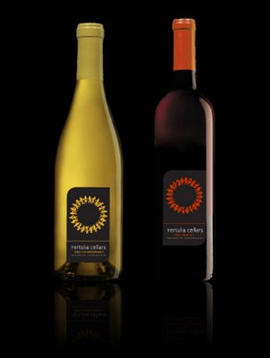


A really nice and classy website and packaging design for Tertulia Cellars by a design & communications agency named Blind Renaissance Design.
great design from across the planet


A really nice and classy website and packaging design for Tertulia Cellars by a design & communications agency named Blind Renaissance Design.
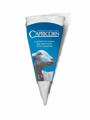
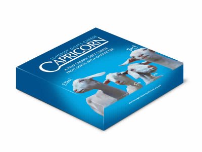
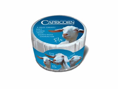
Capricorn Cheese is crafted at the Lubborn Creamery in UK and is made from locally produced goats milk. Situated in the beautiful valley of Cricket St Thomas, the Creamery is surrounded by the lush dairy pastures of Somerset. The team of cheese makers use a method of traditional ripening for full flavour and a creamy texture.
The packaging definetely seems to spread this freshness and the sheep with their cute names definetely add their own sense of sweetness to the pack.
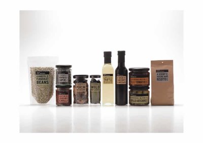 While companies across the planet spend crores on finding a brand name and spends billions on promoting that name, Waitrose, a company from the United Kingdom seems to have taken a radically different approach to the word 'Branding'. There's something so nice about their products that are known by what they actually are.
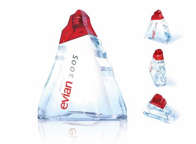
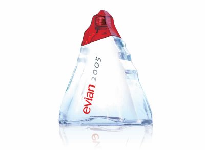
Launched in late 2004 to celebrate the new year, Evian’s 1-L Origine glass bottle is a monolithic ice-like sculpture. The triangular bottle is reminiscent of the alpine mountaintops from which Evian water has flowed for more than 8,000 years.
The design was handled by Landor Paris, whose parent company operates in the United States as Landor Associates. The recyclable bottle is press-and-blow molded of thick glass by Saint-Gobain, which operates in the United States as Saint-Gobain Containers.
The minimalist graphic design includes a polymeric no-label look, done via a front-panel pressure-sensitive label. Required nutritional copy appears on the flat-panel left side label. Both labels are printed in two colors.
The bottle has an injection-molded, red-tinted PET ‘overcap’ that snaps on over a standard 28-mm aluminum screw closure and fits neatly against a sloping area on the bottle’s shoulder. The bottle was distributed through early 2005 to 100 countries including the U.S. where it sells for $2.50, according to Landor Paris’s director of implementation Eric Duschene. The bottles are intended to sell as a gift item.


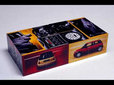

The Rubix Cube has always been a fun thing. Taking a spin on the same concept is this similar DM from the makers of the Mini. This little DM that can be transformed into multiple squares of various dimensions is a really cool way to introduce the range of cars to the customer. The DM also won an award at the EPICA Awards in 2003