Tuesday, January 23, 2007

Bambarria Tequila!


Tequila Bambarria is produced in the highlands of Los Altos, long recognised as the top zone in the state of Jalisco in Mexico where most Tequila is produced. The transparent labels and the distinct colors lend the product a class of its own.

No House Wine!

‘No House’ Wine is a new wine label. Proceeds from the sale of this wine are used to built homes for homeless children who, due to the loss of parents to AIDS, are now ‘young heads of household’ caring for younger brothers and sisters. This housing project, in the Kwazulu Natal region, is an initiative of the Dutch Foundation ‘HomePlan’ and managed by Sister Priscilla from Caritas, South Africa.

Easy Looks Cosmetics!


EasyLooks – a world-premiering cosmetics concept where a complete look is put together in a portable, disposable kit. The premier Looks are as follows: Blue Days Look, Lavender Love Look, Bronze Me Look, Smokey Eyes Look and Silver Nights Look.

The brand identity and package design of EasyLooks is meant to encourage young women to try new makeup looks as willingly as they try different fashion looks. The premiering lineup consists of five different looks, tailored for the Fall and Winter season 2006/07. New looks are scheduled to launch three times a year.

Creative Director(s): Jörgen Olofsson >> Art Director(s): Karin Larsson >> Photographer(s): Henrik Bonnevier >> Other(s): Production Designer: Anna Johansson >> Account Executive: Linda Björk

Valio Milks!

Valio Milks. The leading illustrators of Finland made a cow illustration to the milk packings of Valio. The world's widest and most democratic art project was created from the love of milk. In October-November 2005 it took place when the popular cow illustrations of the milk of Valio changed to the new cow-theme works by most loved artists in Finland. It was probably the world's widest art show/gallery because every month over 30 million milkpackages spread around Finland. Six honoured Finnish artists, Outi Heiskanen, Mauri Kunnas, Rosa Liksom, Kaj Stenvalll, Juba Tuomola and Julia Vuori got excited by this historical project. The artists were chosen by the art critic and curator.

Creative Director(s): Jari Peltonen >> Copywriter(s): Mikko Eskelinen/Lumikki Keski-Orvola/Outi Heiskanen/Mauri Kunnas/Rosa Liksom/Kaj Stenvall/Juba Tuomola/Julia Vuori/Turo Drakvik >> Art Director(s): Jari Peltonen/Juha Murremäki/Jori Kuikka >> Photographer(s): Jori Kuikka >> Web Designer & 3D animation/ Klaus Ala-Aho, Markku Hämäläinen, Miikka Lyytikäinen, Techn. Design

Illustrator(s): Art work: Outi Heiskanen/Mauri Kunnas/Rosa Liksom/Kaj Stenvall/Juba Tuomola/Julia Vuori/Juuso Koponen >> Graphic Designer/Kari Sandell, AD Assistant >> Other(s): Project management: Johanna Piisi, Anu Petäjä, Seija Matikainen/ Sara Suvinen, Kati Wikström web/Minna Leander, Arja Vatanen, Marita Kohvakka Direct/Timo Valjakka, Antti Eklund

Cabernet Sauvignon!


Root One tells the story of the original ungrafted Cabernet Sauvignon rootstock, extinct in Europe and now only found in Chile. The rich history of this woodstock is visually linked to the final glass of wine, an image of which is hidden in the vine. As you read the story the root leads you down to where it all begins, beneath the soil. A gardener's tab creates a unique neck label and emphasises the horticultural theme.

Creative Director(s): David Turner & Bruce Duckworth >> Copywriter(s): David Turner >> Art Director(s): Shawn Rosenberger >> Illustrator(s): Shawn Rosenberger >> Other(s): Client: Click Wine Group >> Awards: Epica Bronze 2006

The Oneonta Starr Ranch Growers!


Attractive, sophisticated packaging that drives consumers to their displays and affirms their expectation of a quality product. Starr Ranch Growers has a beautiful new line of boxes and totes designed to give your stone fruit, cherry, pear and apple categories the competitive edge. To learn more about them, visit the Starr Ranch Website

Tuesday, August 22, 2006

Tertulia Cellars


A really nice and classy website and packaging design for Tertulia Cellars by a design & communications agency named Blind Renaissance Design.

Sunday, August 20, 2006

A Vodka Pack!

The TASK:
To a launch a Virgin branded Vodka, as a mainstream alternative to corporate, sanitised brands like Smirnoff.
THE CREATIVE BRIEF:
Development of brand name, graphics and structure To challenge usual spirit conventions, which normally sell on the premise of demographics and purity. These spirits have unique, evocative characters supported by a motivating story or fact. No bullshit, no hype, its real
THE SOLUTION:
The creation of 3 vodkas with distinct archetype personalities, which have been personified by 3 chaotic, raw and imperfect styles of illustrations and story writing to support their distinct and individual characteristics.

Saturday, August 19, 2006

Bags for YKM Fitness Club

Capricorn Cheese Packaging!


Capricorn Cheese is crafted at the Lubborn Creamery in UK and is made from locally produced goats milk. Situated in the beautiful valley of Cricket St Thomas, the Creamery is surrounded by the lush dairy pastures of Somerset. The team of cheese makers use a method of traditional ripening for full flavour and a creamy texture.

The packaging definetely seems to spread this freshness and the sheep with their cute names definetely add their own sense of sweetness to the pack.

Corporate Identity for The Architecture Museum!


This interesting Corporate Identity Package is from ArkitekturMuseet, the Swedish Museum of Architecture that has something for everyone, from kids to professional architects. In the permanent exhibition called "Architecture in Sweden", the country's architecture is debated and discussed.

Waitrose Cooking Ingredients

While companies across the planet spend crores on finding a brand name and spends billions on promoting that name, Waitrose, a company from the United Kingdom seems to have taken a radically different approach to the word 'Branding'. There's something so nice about their products that are known by what they actually are.
Be it a bottle of Vinegar, a jar of Mayonnaise or a bottle of Beans, they are called just that. The simplicity of their labels and the clear no-nonsense typography works like magic. You can also buy their products online here.

Fixa Brand Identity & Packaging


Liten Ljus Lager


Liten Ljus Lager also means Little Light Lager, a beer from Germany. The packaging was designed by a design agency named Amore. What I like most is the intelligent use of the 3 L's and the superb blend of the Gold and Brown giving it a very premium look.

Evian Water!


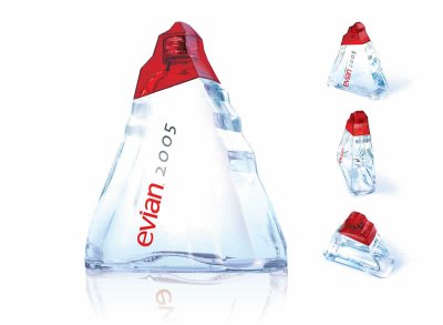
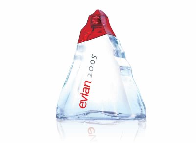
Launched in late 2004 to celebrate the new year, Evian’s 1-L Origine glass bottle is a monolithic ice-like sculpture. The triangular bottle is reminiscent of the alpine mountaintops from which Evian water has flowed for more than 8,000 years.

The design was handled by Landor Paris, whose parent company operates in the United States as Landor Associates. The recyclable bottle is press-and-blow molded of thick glass by Saint-Gobain, which operates in the United States as Saint-Gobain Containers.

The minimalist graphic design includes a polymeric no-label look, done via a front-panel pressure-sensitive label. Required nutritional copy appears on the flat-panel left side label. Both labels are printed in two colors.

The bottle has an injection-molded, red-tinted PET ‘overcap’ that snaps on over a standard 28-mm aluminum screw closure and fits neatly against a sloping area on the bottle’s shoulder. The bottle was distributed through early 2005 to 100 countries including the U.S. where it sells for $2.50, according to Landor Paris’s director of implementation Eric Duschene. The bottles are intended to sell as a gift item.

Direct Mailer For The Mini


The Rubix Cube has always been a fun thing. Taking a spin on the same concept is this similar DM from the makers of the Mini. This little DM that can be transformed into multiple squares of various dimensions is a really cool way to introduce the range of cars to the customer. The DM also won an award at the EPICA Awards in 2003

Friday, August 18, 2006

!GOLB NGISED WEN A FO TRATS EHT

Hey everybody, for those of you who are graphic designers, visualizers, typographers, visual artists, photographers or just that another somebody who's interested in the world of design, welcome to a new space in the un-ending world of design. Each day, there will be more examples of some of the finest and dumbest pieces from the world of design. Sit back and enjoy the ride!